Role
Product Designer
Industry
Healthcare
Duration
6 Months
Company
AiValon
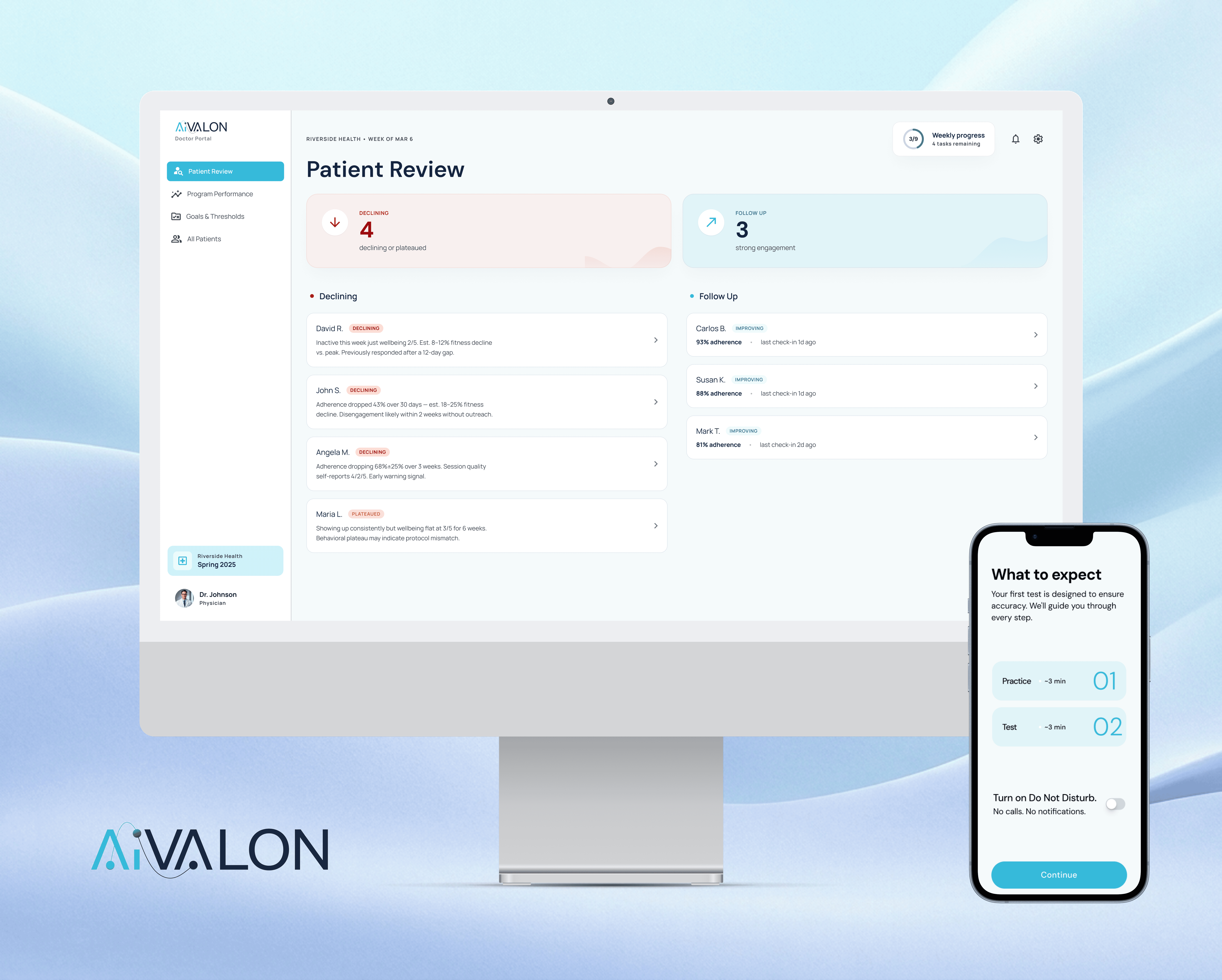

A connected patient and clinician platform that transforms a mobile breathing test into actionable care decisions.
The Technology Worked. Adoption Didn't.
AiVALON had already developed an app that captured heart-rate signals. A failed pilot revealed this was harder than expected.

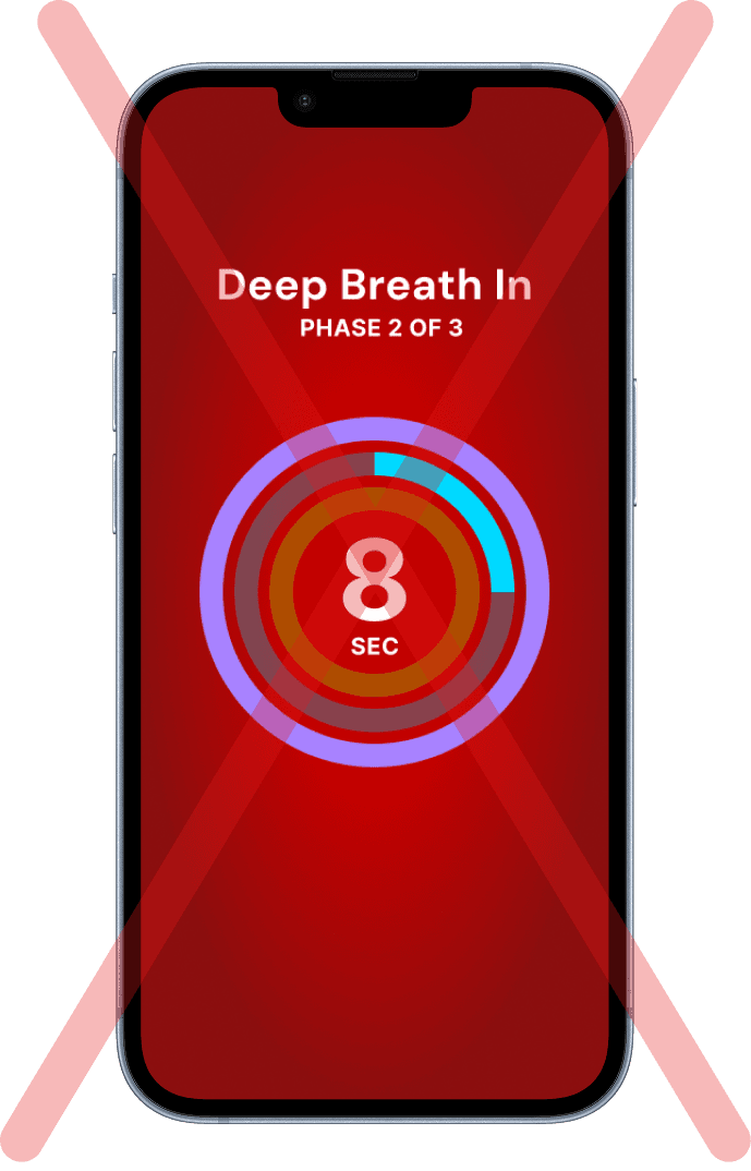
Old mobile app
My Approach

My approach to designing the entire cardiometabolic prevention system
I looked at the pilot data of 500+ participants & identified two critical adoption failures:
patients struggled to follow the breathing rhythm accurately
patients frequently moved their finger off the camera, preventing heart-rate capture

Pilot failures led to clinics losing trust in our cardiometabolic prevention program
Two Flows. Completely Different Needs.
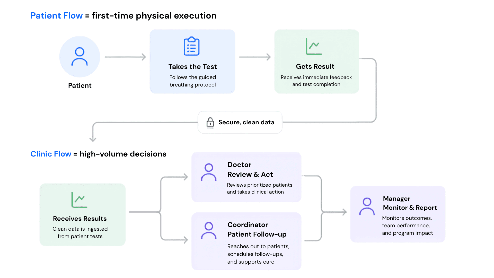
Patient and Clinic Flow
CHALLENGE 1
I surfaced risk signals directly inside the EHR workflow
Rather than pursuing full EHR integration or relying on a standalone dashboard, I proposed a hybrid approach. The EHR widget surfaces patients requiring attention directly within clinicians' existing workflow, while the dashboard supports deeper review and program management when needed.


Role-specific EHR widgets surfaced the next action for doctors, coordinators, and managers without requiring them to leave their existing workflow.
I trained the system to distinguish clinical decline from poor engagement and bad recordings
Doctors and coordinators couldn’t waste limited time on misleading patient signals. We prioritize patients based on decline severity, adherence, and signal quality.


I designed the review workflow around a clinician's core questions: What changed? Why did it happen? What should I do next?
Managers needed to know whether the program was actually improving outcomes or silently failing operationally.

I gave managers control over thresholds so clinics could define what counted as risk, inactivity, or success.

Goals & Thresholds view for manager
I helped managers measure whether outreach and clinical interventions were actually working.

Team view for manager
Result
The hybrid model removes the adoption barrier. Clinics didn’t need to change their workflow or remember to check another tool.
CHALLENGE 2
The Test Only Works if the Breathing Rhythm is Taught Correctly
Too Literal and You're Watching.
Too Simple and You Lose the Rhythm.
Users focused on trying to understand the human body lung animation instead of embodying it.
An Apple-inspired timer circle looked cleaner but users still lost the rhythm.
The animation needed to mirror the breathing rhythm symbolically while also maintaining ease of comprehension and replication.

Lung animation and circular version of the breathing protocol
I turned complex breathing instructions into a simple waveform that users could follow

The waveform guided pace, timing, and transitions so users could focus on breathing rather than interpreting instructions.
I replaced one-time instructions with an embedded practice loop so users can form muscle memory before the real test

Users watched, practiced, and received feedback before proceeding, reducing mistakes during the actual measurement.

CHALLENGE 3
"Finger movement was the number-one cause of bad tests and most users didn't realize they were moving."
- Mahya Khaki’s (Co-founder of AiValon) findings from the Columbia Pilot
The old app fragmented user’s attention during a precision-dependent interaction
Users were asked to simultaneously:
1. Read written instructions
2. Establish finger placement
3. Maintain finger placement
4. Follow the breathing rhythm
Users struggled to shift attention between competing elements which led to loss of finger contact and breathing rhythm.
Old mobile app
I replaced static instructions with real-time validation & feedback. Users Can Now Understand Signal Quality at a Glance
We mapped out guidance for every scenario during signal validation:
Incorrect camera lens
Too much finger pressure
Finger movement
Incomplete camera coverage
Cold fingers

Every signal-quality failure was mapped to a specific intervention, helping users correct mistakes before the breathing test began.
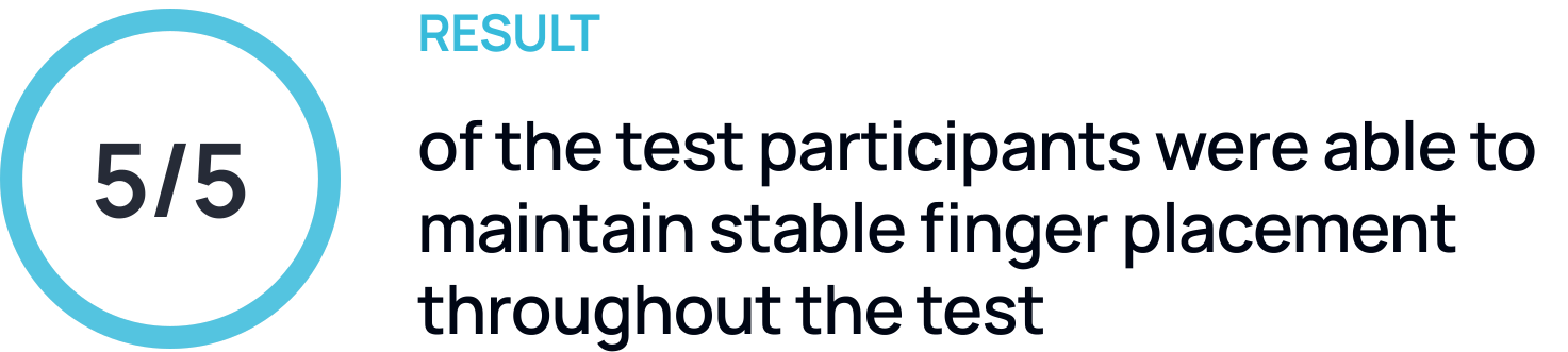
Participant patient guidance improved signal quality, signal quality improved clinician trust, clinician trust enabled triage, and triage made the program scalable.

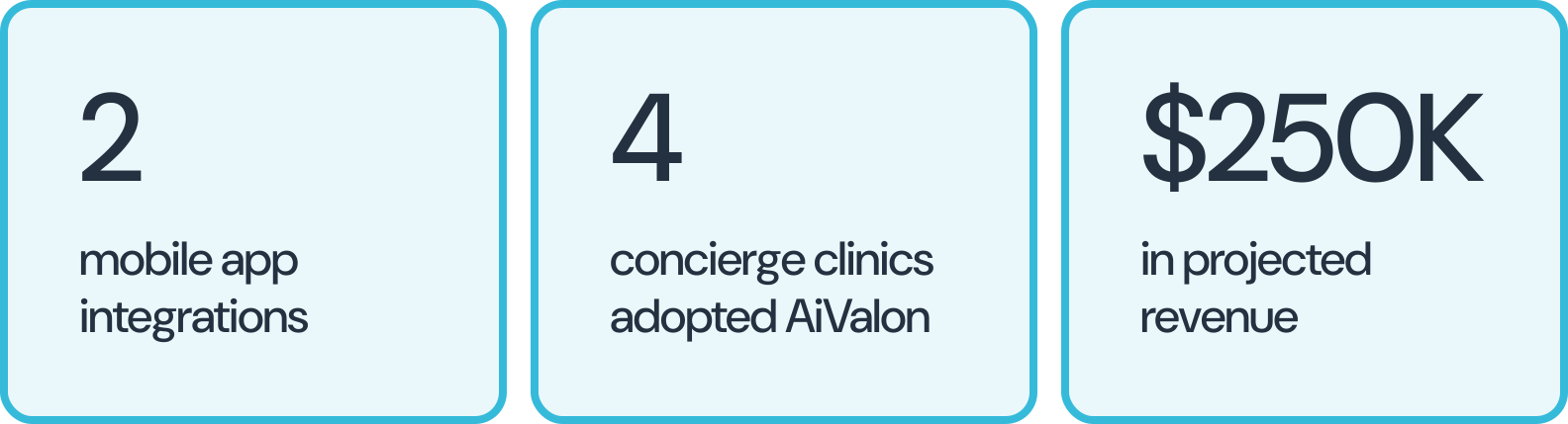
The redesigned experience supported AiVALON's path to scale
What I learned
The biggest problem wasn't teaching users how to breathe
At first, the team focused on improving instructions. Through testing, I realized the real problem was helping users recognize when they were making a mistake. This shifted the solution from education toward validation, feedback, and guided correction.
The hardest design decisions happened outside the interface
The most difficult work was deciding who should see which patients, when clinicians should be notified, and when poor-quality data should be ignored. Designing the triage logic had a greater impact on the system than any individual screen.
Trust had to be earned twice
Patients needed confidence that they were taking the test correctly. Clinicians needed confidence that the results were reliable enough to act on. The product only worked when both groups trusted the system.
Other projects
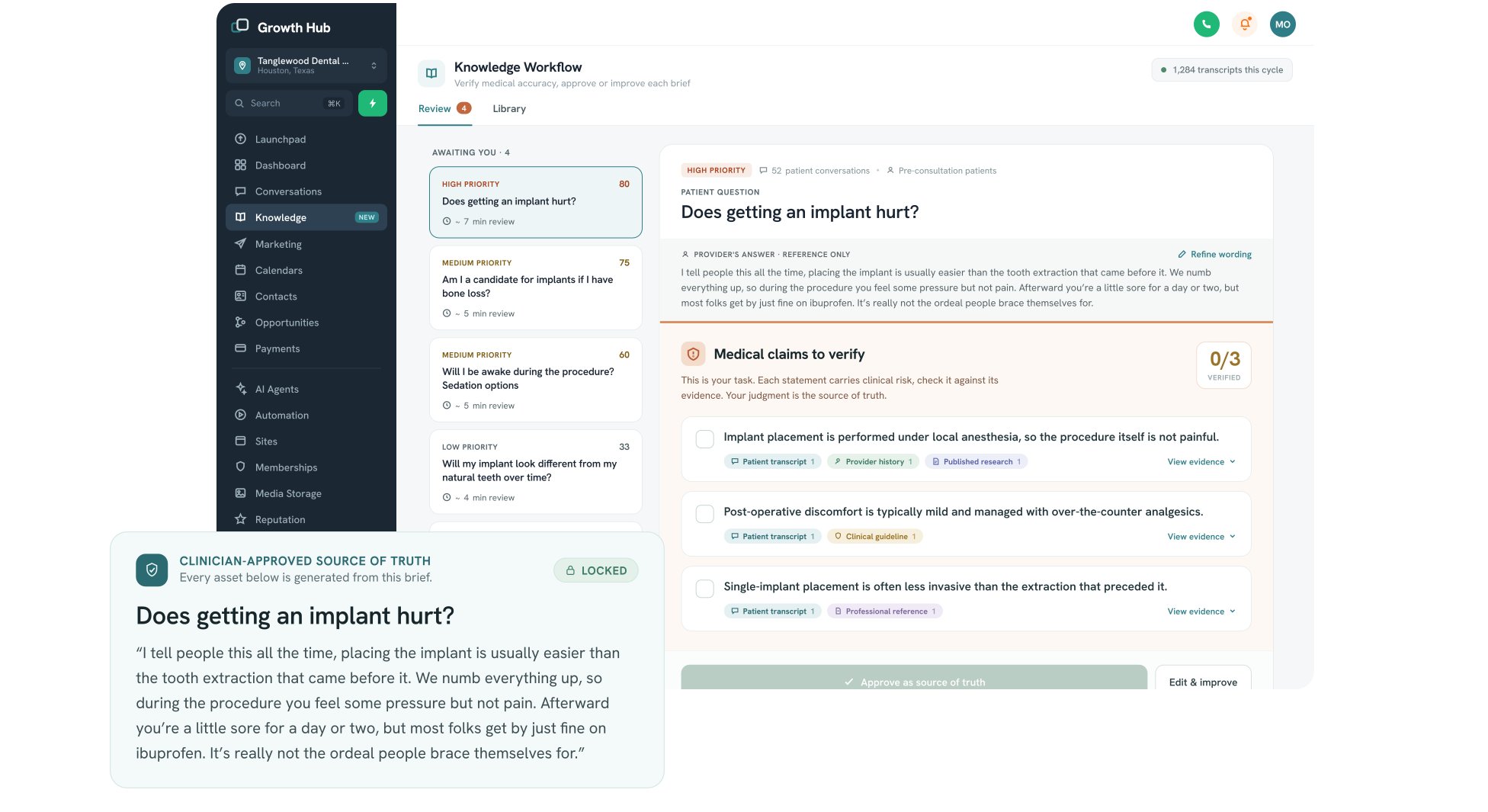
Turning patient conversations into clinician-approved knowledge
DSD already had a manually operated AI content strategy process for clinics. I designed this AI-assisted workflow to systemize that process, helping dental practices capture recurring patient concerns, approve clinical guidance once, and safely reuse that knowledge across patient education.
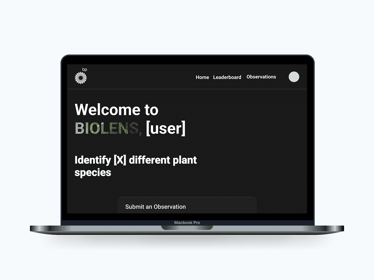
Reimagining How Employees Connect with Nature
Designed an intranet, BioLens, which featured species identification, gamified rankings, and educational quizzes to help bp employees connect with biodiversity.
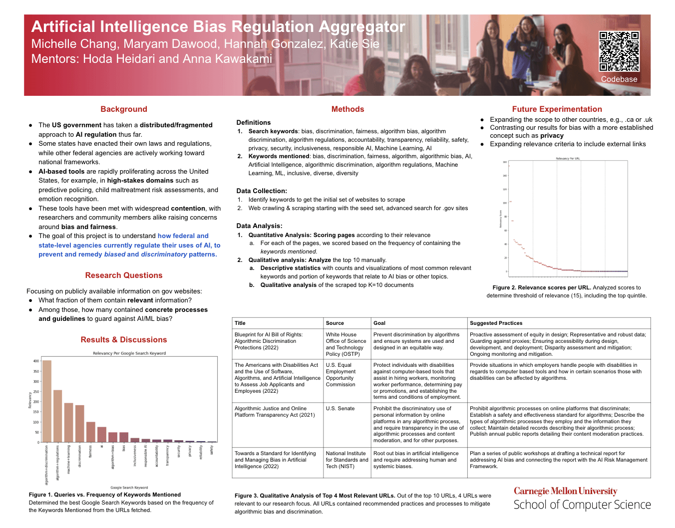
Research at Carnegie Mellon University on AI/Machine Learning
OurCS