DSD
Reimagining Digital Healthcare Service Experiences
Role
Sole UI/UX designer
Industry
Healthcare


https://www.tanglewooddentalassociates.com/
The Problem
Healthcare is emotionally loaded.
Users arriving at healthcare service websites are often anxious, uncertain, and carrying prior negative experiences. Yet, our competitive audit revealed most digital experiences prioritize institutional credibility over addressing emotional risk.
How we discovered this
User interviews revealed trust, not price or convenience, drove decisions.
Behavioral signals showed users willing to travel or delay major life decisions rather than switch providers.
Context
This project began as a zero-to-one initiative. The practice did not have a patient-facing website, which meant users had no digital way to evaluate trust, understand services, or reduce anxiety before booking care.
My role
I was the sole UX designer on this project, responsible for research, information architecture, UX writing, interaction design, and development.
I collaborated directly with the client and marketing stakeholders to align patient needs with business goals.
Tools Used
Notion, Asana, Figma, Webflow, ChatGPT, Claude, Relume, Google Analytics.
North Star
To transform website and content into a trusted guide. One that anticipates anxiety, reduces cognitive load, and helps users move forward with confidence in a sensitive, high-stakes decision.
The Approach
Interviewed users to uncover pain points
Audited competitors to identify systemic UX gaps
Designed IA and content to reduce uncertainty
Validated navigation through tree testing
Iterated based on findings
The Approach
Interviewed users to uncover pain points
Audited competitors to identify systemic UX gaps
Designed IA and content to reduce uncertainty
Validated navigation through tree testing
Iterated based on findings
Translating User Anxiety into Clear Messaging
To refine our approach, I presented and iterated on the key positioning and messaging strategy marketing.
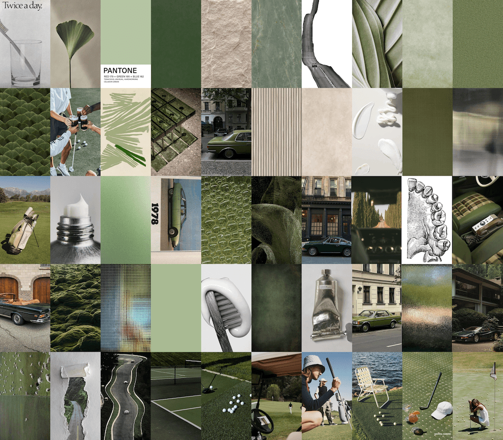
Visual Design Identity
I wanted to hone in on the distinct visual design identity that did not revolve around healthcare but around our user. After identifying our personas we wanted to use images that were familiar to them.
This identity serves as the visual foundation for our UI, digital content, and brand strategy.


Building Trust Through Answering User's Questions
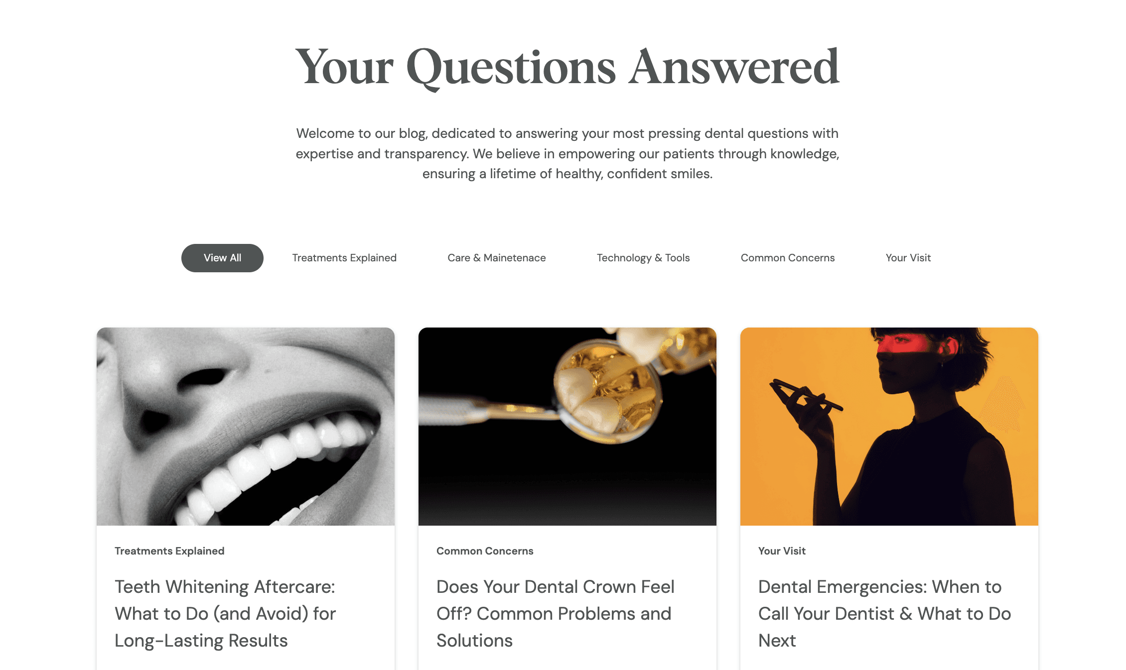
I developed a learning center that positions TDA as the go-to resource for healthcare education. Each article is crafted to address real patient questions asked daily from patients.
I created distinct labels that align with common patient needs and questions using AI. From practical 'Care & Maintenance' information to engaging 'Common Concerns' content each category serves a specific purpose in the patient's journey.


AI That Documents, Monitors, & Analyzes Our Patient Visits
Answering patients' endless questions while documenting consultations was draining the staff's time and focus. Dental Bee solved this challenge by listening to patient visits, automatically recording notes, and identifying questions that need addressing. This AI system helps us create targeted content for common concerns while letting us focus on what matters most, curating the patient journey.


User-First Navigation: Writing for Patient Understanding
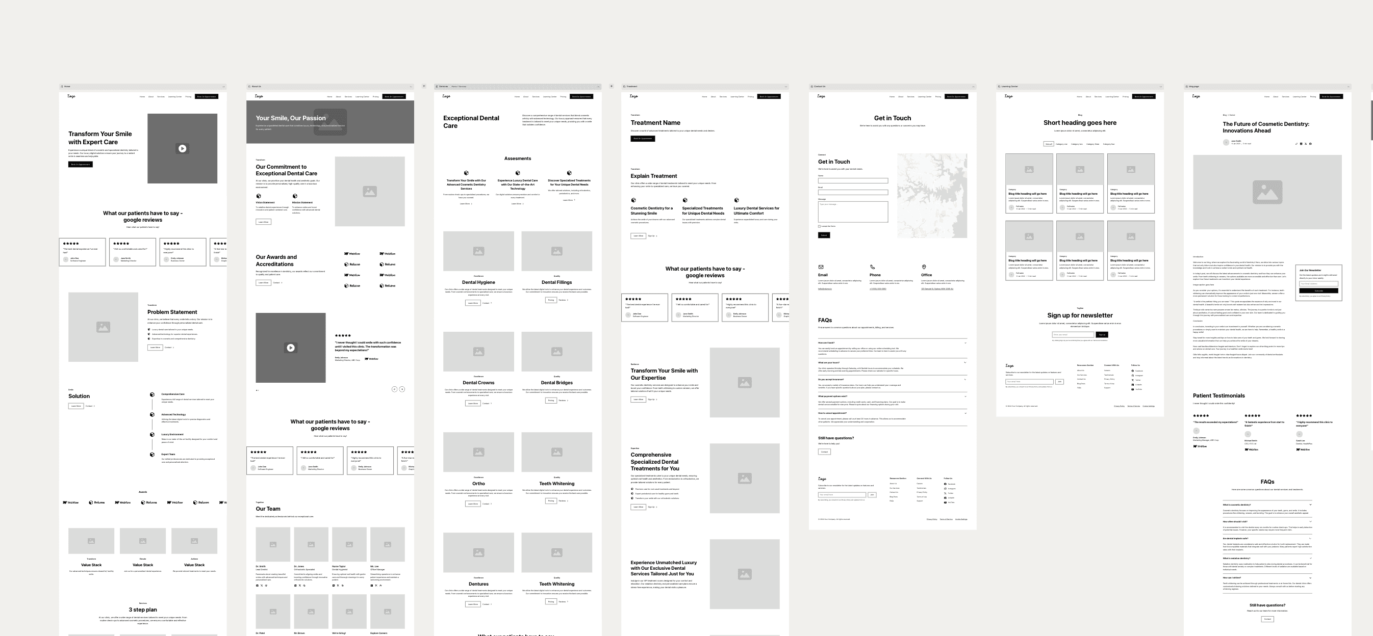
I designed the navigation following minimalist principles championed by Tesla. Instead of cluttered menus, we focused on essential services with meaningful, patient-centric labels.
For example, rather than using traditional terms like 'Cosmetic Dentistry' or 'Smile Design' that emphasize aesthetics alone, we chose 'Smile Restoration' to reflect our comprehensive approach. This intentional language shift communicates that we're not just focused on surface-level appearances, but rather on restoring both the function and beauty of your smile for lasting oral health.


Validating Navigation with Tree Testing
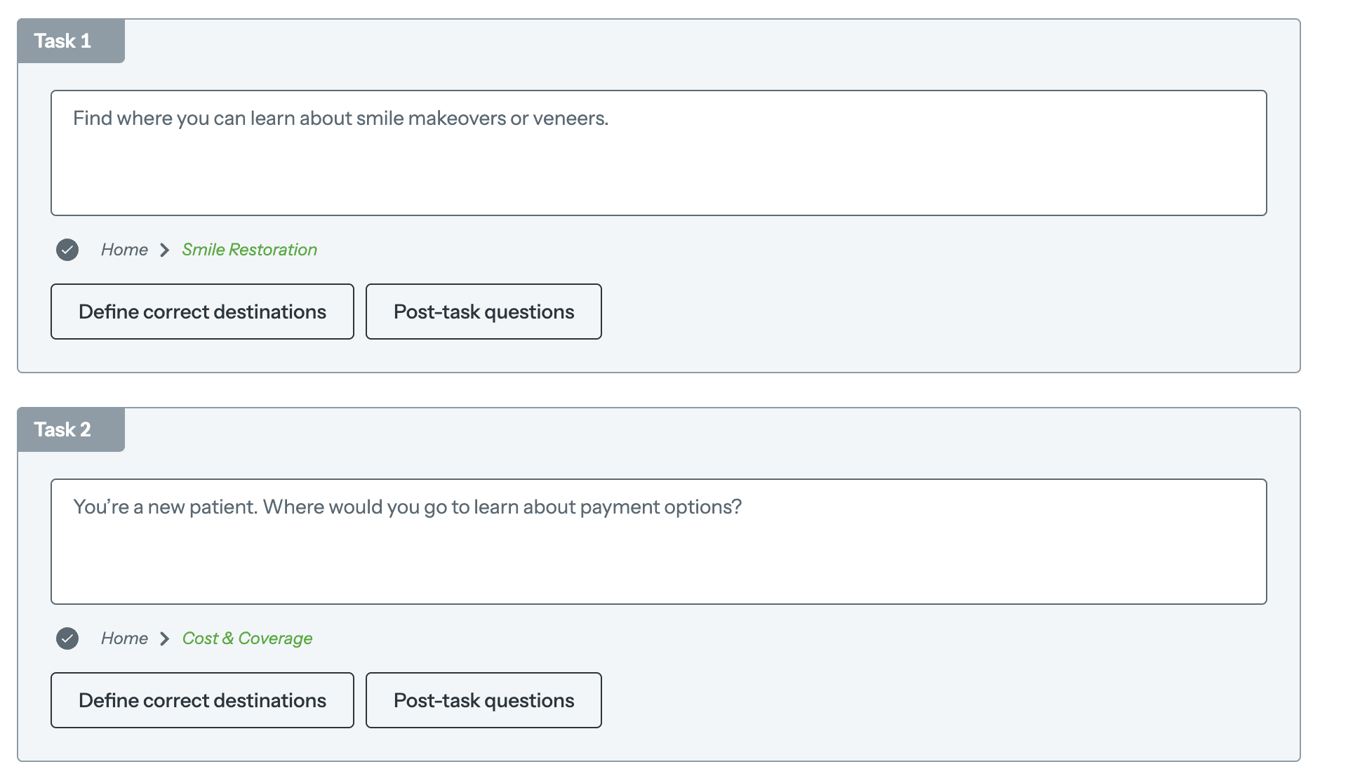
I knew that our dental clinic site's navigation was unconventional which led me to conduct a tree test using Optimal Workshop. The goal was to validate the clarity and effectiveness of our site's navigation structure, ensuring that patients can easily locate critical information such as aesthetic restorative treatments, general dentistry, pricing details, and our clinic's background.




Tree Test Results
Navigation label | % of users that got the task correct |
|---|---|
Smile Restoration | 100% |
Cost & Coverage | 100% |
Book an Appointment | 100% |
Lifelong Care | 70% |
Learning Center/Your Questions Answered | 70% |
Learning Center/Our Story | 100% |
After receiving the results, we decided to further iterate over our navigation labels. Users seemed to get Lifelong Care confused with Your Questions Answered. We decided to change Lifelong Care to Lifelong Services to clarify that this where you can find information about preventative care services at TDA.
Web Development
Webflow Development: I chose Webflow as our development platform because it is the industry leader for CMS-heavy sites, making it the perfect solution for our content-driven approach. Additionally, I integrated Google Analytics to measure engagement.
SME Collaboration: Gathering insights from subject matter experts to refine treatment descriptions and service structure on our site.
Brand Positioning and Messaging on Site: Developed trust-building site content like "Our Commitment to Excellence" instead of a traditional "awards" section to reflect authenticity.
What's next…
Persona Development: Using AI transcripts of patient visits to identify patterns and create data-backed personas. This helps tailor the experience to real patient needs and concerns.
Patient Journey Mapping: Designing distinct content and UX paths for each persona, ensuring the site adapts to various stages of the customer journey.
Conversion Tracking & ROI: Implementing tracking to measure which content influences conversions, enabling us to double down on what works and refine what doesn’t.
More Projects Like This


bp
Reimagining Energy Through Design.


studyfit.
Personalized Fitness for Students


The Coffee House at West End
Brewing a Bold New Website Revamp


Frenzies
Developed a Quote Gallery That Sparks a Frenzy.


HappyHound
A curated e-commerce platform delivering luxury dog accessories.


OurCS
Research at Carnegie Mellon University on AI/Machine Learning


CalenDoc
Streamlining Your Healthcare Journey with Seamless Appointment Scheduling | Software Engineering Academic Capstone Project.


Matchbox
A vibrant card matching game built utilizing object orientated programming and UI design.